Maroon Color Meaning, Codes, Symbolism, Psychology + More
Maroon sits at the darkest end of the red family on the color wheel. It blends red’s raw intensity with the grounding weight of brown and black.
That combination gives maroon a remarkable character. It feels bold but controlled. It reads as passionate yet restrained. Likewise, it carries fire without the recklessness that pure red sometimes invites.
Picture leather-bound books and aged burgundy wine. Think of autumn forests at their peak. Consider the uniforms of elite universities and the deep tones of aged mahogany wood. These images share a common thread. They feel earned. Maroon almost never reads as cheap or accidental.
In color psychology, maroon is known as the shade of controlled passion and serious ambition. It also carries meanings of resilience, deep love, and time-tested strength.
This color does not ask for quick attention. It earns a second look. It prompts the kind of feeling that settles into the chest rather than jumping into the throat.
Maroon does not shout. Yet it is never ignored.
Key Takeaways
Maroon stands for courage, deep emotional commitment, sacrifice, and enduring strength. Psychologically, maroon channels focused ambition, emotional depth, and grounded personal power. Spiritually, maroon connects to the root chakra and themes of survival, stability, and ancestral energy. For brands, maroon communicates heritage, trust, premium quality, and authority. Across cultures, maroon symbolizes mourning, honor, religious devotion, and earned achievement.
What Is the Color Maroon?
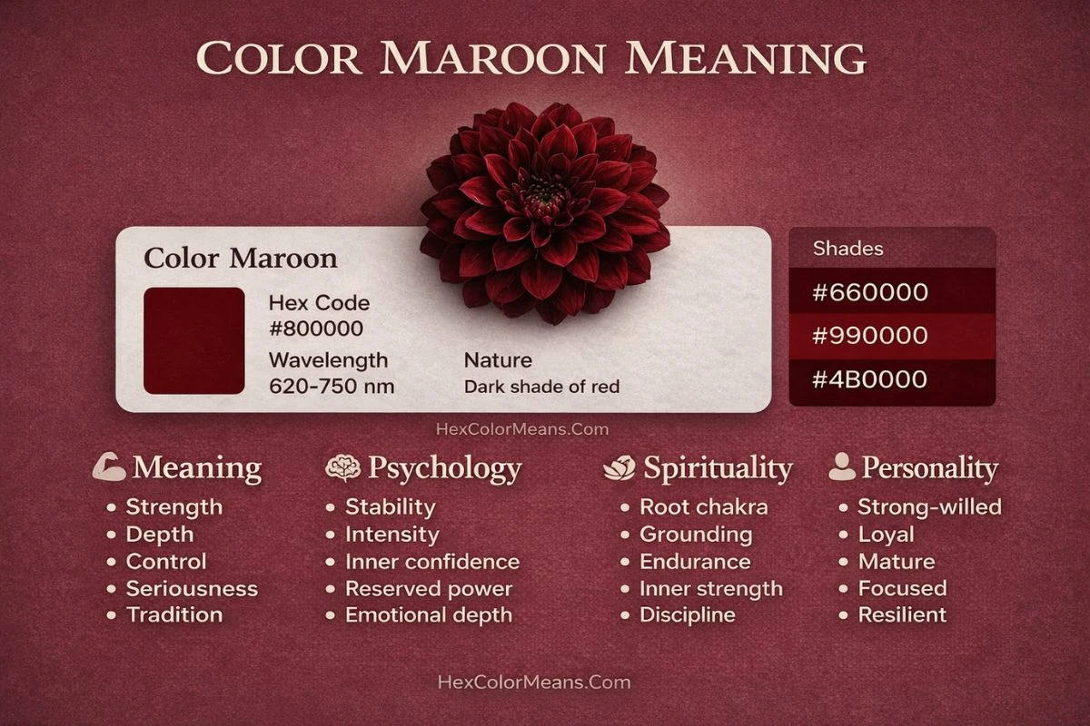
Maroon is a dark brownish-red color. It sits between deep red and brown on the color spectrum. You produce it by mixing red with a significant amount of brown or black pigment.
Common digital codes for true maroon are listed here.
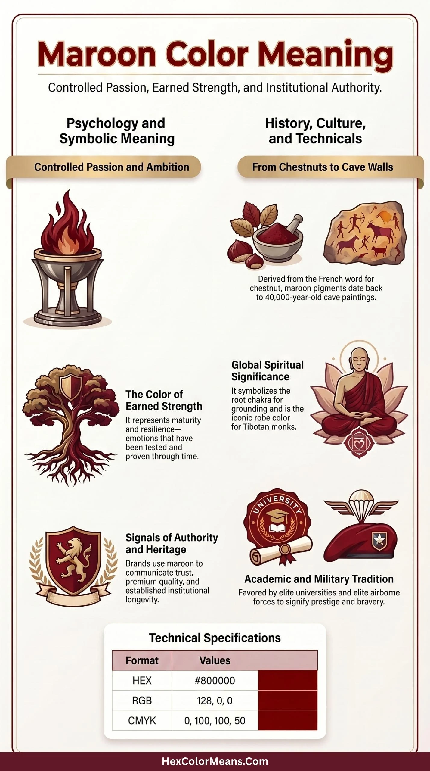
- HEX: #800000
- RGB: 128, 0, 0
- HSL: Hue: 0°, Saturation: 100%, Lightness: 25%
- CMYK: 0, 100, 100, 50
Visually, maroon is one of the more grounded members of the red family. While true reds can feel aggressive or alarming, maroon feels deliberate and composed. According to research published in the Journal of Experimental Psychology, darker, more saturated warm colors are consistently associated with competence, seriousness, and authority, qualities that maroon naturally embodies.
Maroon also has a notable presence in the natural world. The color appears in dried autumn leaves, aged wood grain, certain varieties of deep roses, pomegranate interiors, and the feathers of several bird species. This natural occurrence contributes to the color’s sense of authenticity and organic richness.
The color maroon is not a single emotional personality. It spans a range depending on its exact shade and surrounding tones. Its most recognized variations include:
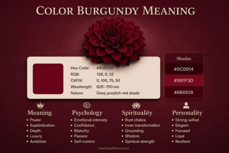
Burgundy: A cooler, wine-toned maroon with a slight purple cast. It feels refined and is strongly associated with wine culture, luxury fashion, and Italian design.
Oxblood: A very dark, earthy maroon that reads almost black in low light. It is the choice of traditional leather goods, law school culture, and classic menswear.
Crimson: A brighter, more vivid edge of the maroon family. It retains more of red’s urgency while still carrying maroon’s depth.
Dark Cherry: A sweet, warm maroon that leans toward plum. It feels romantic and slightly nostalgic.
Rosewood: A muted, dusty maroon with strong brown undertones. It is common in interior design for its warmth and sophistication.
What Colors Go With Maroon
Pairing maroon with the right colors creates compositions that feel deep, passionate, and anchored. Because maroon carries such intense warmth and weight, the colors around it can either amplify its richness or provide necessary relief.
Blush and dusty pink: Creates a sophisticated, tonal pairing that softens maroon’s intensity. The lightness of blush lifts maroon without turning sweet or childish.
Gold and brass: Adds luminosity, luxury, and a sense of old-world richness. This combination feels regal, ceremonial, and timeless in both fashion and interiors.
Sage green: Introduces an earthy, muted contrast that grounds maroon’s heat. The pairing feels organic, understated, and surprisingly modern.
Cream and bone: Offers a warm, breathable neutral that prevents maroon from feeling heavy or closed in. This combination feels inviting and elegant.
Navy blue: A deep, authoritative contrast that plays on maroon’s red undertones. Navy and maroon together feel preppy, confident, and substantial.
Charcoal gray: Provides a quiet, absorbing backdrop that lets maroon’s warmth lead. This pairing feels serious, urban, and refined.
Similar Colors to Maroon
If you are looking for colors similar to maroon, consider these alternatives.
Burgundy (Hex: #800020): A slightly brighter, more purple-toned red-dark than maroon. Burgundy feels more European and wine-influenced, while maroon leans browner and earthier.
Oxblood (Hex: #4A0404): A darker, more intense near-black red with less brown. Oxblood carries a leathery, vintage toughness that maroon softens into sophistication.
Crimson (Hex: #DC143C): A much brighter, cooler true red with none of maroon’s brown base. Crimson feels energetic and alert, where maroon feels settled and deep.
Mahogany (Hex: #4E2A1A): A wood-inspired reddish-brown with significantly less red intensity than maroon. Mahogany feels warmer, more natural, and more obviously brown.
Russet (Hex: #80461B): A lighter, more orange-brown red that sits between maroon and terracotta. Russet feels autumnal and rustic, while maroon remains richer and more formal.
History and Interesting Facts
History of the Color Maroon
Maroon has a rich and layered history that stretches back thousands of years. The color’s name itself comes from the French word “marron,” meaning chestnut. The French used this term to describe the deep brownish-red of roasted chestnuts.
In ancient civilizations, deep red pigments were produced using ochre, iron oxide, and later madder root. These pigments were among the earliest used by humans. Cave paintings dating back over 40,000 years, such as those at Altamira in Spain, used iron-rich red ochre that produces colors very close to modern maroon.
In the ancient world, this deep red shade was a color of warriors and rulers. Roman legions carried banners in deep crimson and maroon tones. The connection between dark red and military power persisted for centuries.
During the medieval period, maroon gained new associations through the wine trade. Bordeaux wines, exported across Europe, gave their name to a particular shade of maroon still called “bordeaux” in many European languages. Wine merchants and aristocrats who could afford Bordeaux were understood to be people of substance and refinement.
By the 18th and 19th centuries, maroon became a favored color for academic institutions. Harvard, the University of Chicago, and Texas A&M University all adopted maroon as a primary color. This choice was deliberate. Maroon communicated seriousness, longevity, and institutional authority in a way that brighter colors simply could not.
Interesting Facts About the Color Maroon
Several compelling facts place maroon in a unique position among colors.
Maroon is one of the oldest named colors in the English language, with documented use dating to the early 17th century. Its early use was almost always linked to textiles and dyes rather than paint, reflecting the color’s close connection to craft and material culture.
The word “maroon” in English has a separate, unrelated meaning rooted in colonial history. To be “marooned” meant to be abandoned on a desolate island. This linguistic association gives the color an unexpected secondary dimension of isolation and survival.
Studies on color and appetite conducted at the Cornell Food and Brand Lab found that deep red tones, including maroon, are associated with feelings of richness and fullness. Fine dining restaurants frequently use maroon in their interiors and menus for exactly this reason.
Maroon’s association with universities is a global phenomenon. Institutions as different as Fordham University in New York, Loyola University in Chicago, and universities across Australia and the United Kingdom have selected maroon as a symbol of academic credibility and lasting tradition.
Research in color perception indicates that maroon performs exceptionally well in low-light conditions. Unlike bright reds, which can appear washed out under certain lighting, maroon retains its depth and richness. This quality makes it a reliable choice for print design, packaging, and branding materials.
In heraldry, the equivalent of maroon was sometimes called “sanguine” or “murrey.” These colors appeared on the coats of arms of noble families, where they symbolized patience in battle and victory achieved through endurance rather than impulsiveness.
Symbolism and Representation
Maroon carries a symbolic weight that few other colors can match. It sits at the intersection of passion and control, courage and grief, love and loss. This complexity is precisely what gives it such enduring power across cultures and time periods.
At its core, maroon represents emotions that have been tested and survived. It is not the color of new love or fresh excitement. It is the color of commitment that has been proven through difficulty. And, it speaks of things that have aged, deepened, and grown stronger through challenge.
Maroon also carries a strong connection to sacrifice. In many cultures, deep red and maroon tones are used to mark moments of great personal cost, whether physical, emotional, or spiritual. The color acknowledges that meaningful things often come at a price.
Unlike its brighter cousin red, maroon does not seek to alarm or provoke. Instead, it invites reflection. It asks the observer to slow down and consider something more carefully. This quality makes maroon one of the most psychologically layered colors in the visible spectrum.
The color also carries connotations of institutional power. When you see maroon on a university seal, a legal document header, or a luxury product package, the message is consistent. This entity has been here long enough to have earned its place. Maroon signals earned authority rather than claimed authority.
Meaning of the Maroon Color in Spirituality
In spirituality, maroon carries a deep and grounded energy. It is primarily associated with the root chakra, known in Sanskrit as Muladhara. This energy center is located at the base of the spine. It governs a person’s most fundamental sense of safety, belonging, and physical existence.
A balanced root chakra creates feelings of stability and presence. It supports a person’s ability to meet basic needs, feel secure in their body, and remain grounded during periods of stress or change.
A disrupted root chakra, by contrast, can create persistent anxiety, a feeling of being untethered, or an inability to feel safe regardless of external circumstances. Maroon, as a color linked to this energy center, is used in spiritual practice to support reconnection with the body and the earth.
In Tibetan Buddhism, deep maroon and burgundy are the primary colors of monastic robes. These shades were chosen with intention. They represent the renunciation of attachment and the beginning of a path toward liberation. High-ranking lamas and monks throughout Tibetan practice wear maroon as a daily reminder of this commitment.
Maroon also appears in Hindu religious contexts, where it is associated with Shakti, the divine feminine energy of creation and transformation. Certain temples use maroon in their ceremonial textiles and offerings to invoke this powerful, life-giving force.
Many shamanic traditions across South America and parts of Africa associate deep red-brown tones with the earth itself, ancestral spirits, and the protective energy of the land. In these contexts, maroon connects the practitioner to those who came before and the ground beneath their feet.
Psychological Meaning of Color Maroon
Psychologically, maroon operates on a slow, deep register. It does not create the immediate spike of alertness that bright red does. Instead, it builds a sustained psychological atmosphere of seriousness, depth, and grounded intensity.
Maroon activates feelings of focused ambition. People exposed to maroon tones in environments tend to approach tasks with greater deliberateness. Research on environmental color and cognitive performance, including findings from the University of British Columbia, has shown that darker warm tones encourage more careful, analytical thinking compared to lighter or cooler tones.
The color also has a notable effect on emotional processing. Maroon encourages people to sit with feelings rather than deflect them. This can be deeply valuable for individuals working through grief, processing a significant life change, or engaging in serious creative work. It creates space for complexity rather than demanding simple emotional responses.
At the same time, excessive exposure to maroon can amplify heaviness. People who spend too much time in maroon-dominated environments may begin to feel weighed down, overly serious, or emotionally fatigued. The same depth that makes maroon so powerful can become oppressive without relief from lighter or cooler tones.
Maroon also carries a strong association with memory and nostalgia. Because so many people encounter maroon in significant institutional settings (schools, hospitals, places of worship, libraries), the color tends to trigger reflective emotional states connected to formative experiences.
Color Maroon Personality Traits
Positive Traits
People drawn to maroon tend to share a distinct set of strengths. They approach life with a quiet but unmistakable sense of purpose. Their commitments are genuine and long-lasting. They are not easily swayed by trends or social pressure.
These individuals tend to demonstrate exceptional follow-through. Where others may abandon projects when the initial excitement fades, maroon personalities dig in. They are drawn to mastery rather than novelty.
Emotionally, people who favor maroon tend to be deeply loyal. They invest significantly in their relationships, professional work, and personal values. Their love is not flashy but it is durable. They feel things profoundly but often process those feelings privately before sharing them.
Maroon personalities are also frequently drawn to tradition, history, craftsmanship, and quality. They prefer things that last over things that shine. They are more likely to buy one excellent item than five mediocre ones.
Negative Traits
The same intensity that gives maroon personalities their depth can also create friction. They can be slow to forgive and may hold onto resentments longer than is healthy. Their high standards, applied to themselves and others, can slide into perfectionism and judgment.
Their tendency toward internal processing can read as emotional unavailability to people who communicate more openly. Partners or colleagues may feel shut out when a maroon personality is working through something difficult.
Stubbornness is a real risk. The same resolve that drives their best qualities can harden into an unwillingness to adapt or reconsider. They may resist help, even when they clearly need it.
What Does the Bible Say About the Color Maroon?
The Bible does not use the specific term “maroon,” but deep crimson and blood-red tones carry significant theological meaning throughout both the Old and New Testaments. These shades, which correspond closely to what we today call maroon, appear repeatedly in contexts of sacrifice, covenant, and sacred authority.
In Exodus 26, God instructs Moses to construct the tabernacle using fine linen of blue, purple, and scarlet. The scarlet thread here is understood by many biblical scholars to represent the blood of sacrifice and the covenant relationship between God and his people. This association of deep red with covenantal commitment runs throughout the Hebrew scriptures.
Isaiah 1:18 contains one of the most striking color references in the entire Bible: “Though your sins be as scarlet, they shall be white as snow; though they be red like crimson, they shall be as wool.” Here, deep red and crimson (the biblical equivalents of maroon) symbolize the full weight of human failure and the radical nature of divine forgiveness.
In the New Testament, the robe placed on Jesus before his crucifixion is described in Matthew 27:28 as scarlet. This detail connects the passion narrative directly to the imagery of sacrifice that runs through the entire Old Testament.
The Book of Revelation uses the imagery of crimson and scarlet extensively. In Revelation 17, these colors mark figures of worldly power and corruption, a use that shows how deeply the biblical tradition understood dark red as a color of immense power, capable of representing either the highest faithfulness or the deepest betrayal.
Cultural and Religious Significance of the Maroon Color
Christianity
In Christian liturgical tradition, deep red (including maroon and burgundy shades) is used on Pentecost Sunday and during feast days honoring martyrs. This practice is universal across Catholic, Anglican, Lutheran, and many Orthodox denominations.
The color marks occasions that commemorate those who gave their lives for their faith. It serves as a visible reminder that the church was built not only through teaching and prayer, but through sacrifice and suffering. Churches drape their altars in deep red on these days to create a prayerful atmosphere of solemn remembrance.
Hinduism
In Hindu practice, maroon and deep red tones appear extensively in temple architecture, ceremonial clothing, and offerings. The color is considered auspicious and protective. Married Hindu women traditionally wear sindoor, a deep red powder, as a mark of their status and a symbol of the health and longevity of their husbands.
The goddess Kali, one of the most powerful figures in the Hindu pantheon, is frequently depicted wearing deep red and maroon. These colors represent her capacity to destroy ignorance and ego, fierce compassion in action.
Buddhism
Maroon is the defining color of Tibetan Buddhist monastic culture. The robes worn by monks and lamas across the Gelug, Kagyu, Nyingma, and Sakya schools of Tibetan Buddhism are primarily maroon with accents of saffron yellow. This combination has been used for centuries and immediately identifies a practitioner of this tradition to anyone familiar with it.
The choice of maroon was not arbitrary. It was selected for its earthy, grounded quality, a reminder to practitioners that spiritual development is rooted in embodied human experience rather than idealized abstraction.
Japanese Culture
In Japan, deep red and burgundy shades have long been associated with longevity, vitality, and protection from evil. Torii gates at Shinto shrines are traditionally painted in a deep vermillion-red that borders on maroon. This color is believed to ward off negative energy and mark the boundary between the ordinary world and sacred space.
In traditional Japanese aesthetics, the concept of “wabi-sabi” (the beauty of impermanence and imperfection) often finds visual expression in weathered, darkened reds and maroons. Aged lacquerware and autumn maples at their darkest point are cherished precisely because their color tells a story of time.
African Symbolism
Across numerous African cultures, deep red and maroon tones are used in ceremonial contexts to mark rites of passage, honor warriors, and invoke ancestral protection. Among the Maasai of East Africa, red is a color of courage, bravery, and unity. Their deep red-dyed cloaks, called shukas, carry this meaning visually wherever they are worn.
In Akan culture in Ghana, the kente cloth tradition includes maroon and dark red threads woven into patterns that carry specific royal and spiritual meanings. These patterns are not decorative alone. They are communicative, carrying encoded cultural information about the wearer’s identity and lineage.
Western Society
In contemporary Western culture, maroon functions as a signal of institutional credibility and subdued sophistication. Law firms, universities, financial institutions, and heritage brands frequently use maroon in their visual identities to communicate stability and trustworthiness.
In fashion, maroon experiences cyclical revivals. It tends to rise in popularity during periods when consumers gravitate toward authenticity and quality over novelty and trend. The Pantone Color Institute has recognized deep wine and burgundy tones in its annual trend forecasting multiple times in the past decade, reflecting maroon’s enduring cultural relevance.
Dream Interpretations of Color Maroon
Maroon in dreams tends to signal deep emotional processing and transformation rooted in lived experience rather than imagination. Unlike brighter red, which in dream analysis often points to urgent desire or alarm, maroon points to something slower and more complex.
Dreaming of maroon clothing frequently indicates a period of personal reckoning. The dreamer may be coming to terms with a significant decision, processing a loss, or stepping into a new phase of maturity. The act of wearing the color suggests the dreamer is consciously taking on a heavier emotional or spiritual load.
Maroon walls or rooms in dreams often represent the interior emotional life. A room painted maroon may signal that the dreamer has been keeping significant feelings private, contained within an inner space that others do not access.
Seeing maroon blood in dreams, while potentially disturbing on waking, is often interpreted in dream psychology as a symbol of life force being renewed through difficulty. The wound is real, but so is the healing.
A maroon flag or banner in dreams points to group identity, loyalty, and the desire to belong to something larger than oneself. The dreamer may be questioning their allegiances or reaffirming them.
Maroon flowers in dreams suggest a love that has moved past infatuation into something more grounded and durable. These dreams often arrive when a relationship is deepening in meaningful ways.
How to Use the Color Maroon
Maroon creates atmosphere without aggression. It carries weight without heaviness when used with skill. The sections below show its most practical applications across different fields.
Maroon Color in Business
Maroon makes a specific and reliable statement in professional contexts. It communicates that an organization values continuity over novelty, depth over flash, and substance over spectacle.
Law firms have long favored maroon in their interiors, stationery, and signage. The color aligns visually with the qualities these firms want to project: authority, discretion, and time-tested expertise. Medical practices, financial advisors, and academic institutions use it for similar reasons.
A workspace incorporating maroon tends to encourage methodical work. Employees in maroon-toned environments report higher levels of concentration during tasks that require sustained focus. The color suppresses distraction and reinforces a sense of professional seriousness.
Maroon is less effective in environments that prioritize rapid innovation and spontaneous collaboration. Startups seeking to project an energy of disruption typically avoid it for this reason.
Maroon Color in Branding and Marketing
Maroon builds brand identities that feel established and trustworthy. It is the visual equivalent of a firm handshake and a long track record.
Several globally recognized brands use maroon effectively. Harvard University’s visual identity relies on a specific shade of crimson that borders on maroon, reinforcing 380 years of academic tradition. Aston Martin uses deep maroon accents to emphasize craftsmanship and exclusivity. The logo of American Airlines is built around a dark red closely related to maroon. Heinz uses deep red-maroon across its packaging to signal the richness and quality of its products.
The most effective use of maroon in marketing targets consumers who value quality, heritage, and authenticity. These are audiences who read the details, research before they buy, and resist being manipulated by hype. Maroon speaks to them without over-promising.
Maroon also performs well in industries where credibility is the primary purchase motivator. Legal services, financial planning, medical practices, premium food and beverage, and educational institutions are all natural fits.
Maroon Color in Interior Design
In interior design, maroon functions as an anchor. It grounds a space and prevents it from feeling lightweight or superficial.
Used on a single accent wall in a living room or study, maroon creates immediate depth and intimacy. It draws the walls inward in a way that feels cozy rather than claustrophobic when balanced correctly. Pair it with cream, warm white, or sand tones to keep the space from becoming too heavy.
In dining rooms, maroon is exceptional. It slows the pace of a meal, encourages conversation, and makes the experience of eating feel more ceremonial. This is not accidental. The color’s proven effect on appetite perception, documented in color psychology research, makes it a favored choice for upscale dining environments worldwide.
Bedrooms incorporating maroon accents create an atmosphere of warmth and emotional safety. Deep maroon bedding or curtains paired with natural wood tones and soft lighting produce a room that feels genuinely restful. Avoid overusing maroon in children’s rooms, where its weight and seriousness can feel oppressive to young sensibilities.
In home libraries and studies, maroon is nearly unmatched. It pairs naturally with leather, dark wood, aged paper, and warm-toned metals. These combinations produce spaces that feel built for deep thinking and sustained intellectual work.
Maroon Color in Cinema
Filmmakers use maroon with deliberate precision. The color carries too much narrative weight to be placed casually.
In period dramas and historical films, maroon appears in the costumes and interiors of characters who hold power or who have paid a significant personal price for their status. Directors use the color to distinguish individuals who have lived a great deal from those who are still beginning their journey.
In psychological thrillers, maroon in set design can create a sustained sense of dread without relying on the immediate alarm of bright red. It suggests something has already happened here, something heavy and unresolved. The color implies history rather than immediacy.
Several acclaimed directors have used maroon strategically. Stanley Kubrick’s use of deep red in “The Shining” exemplifies how this range of the red family can create persistent psychological unease. Wes Anderson frequently uses maroon in his highly composed aesthetic to ground his whimsical worlds in a sense of historical weight and institutional authority.
Maroon Color in Humans
People who consistently choose to wear maroon tend to project a specific set of qualities to observers. Studies on color perception in social contexts, such as those summarized by the American Psychological Association, indicate that individuals wearing dark, warm tones are rated by strangers as more competent, more confident, and more serious than those wearing lighter or cooler colors.
Wearing maroon communicates that you are not seeking approval through novelty. It signals that your confidence is grounded rather than performed. This quality makes maroon an excellent choice for high-stakes professional situations where you need to project authority without aggression.
Maroon also reads as emotionally mature. People who choose it tend to be seen as individuals who have worked through significant experiences and carry that depth with dignity rather than drama.
Maroon Color in Makeup
Maroon opens a sophisticated creative range in makeup application. Its depth and warmth allow it to enhance a variety of skin tones, with particular brilliance on deeper complexions where the richness of the color fully emerges.
Maroon lipstick is perhaps the most iconic application. Unlike true red, which demands attention and can feel performative, maroon lipstick conveys a quieter, more assured confidence. It pairs naturally with minimal eye makeup because the color on the lips carries enough visual weight on its own.
For the eyes, maroon eyeshadow placed in the crease or outer corner creates depth and a smoky effect without requiring multiple colors. It serves as a sophisticated alternative to the common brown or black smoky eye. On lighter skin tones, maroon shadow can create a subtle warmth that flatters without overpowering.
Maroon nail color is a perennial choice in autumn and winter collections because it complements the season’s palette of amber, gold, rust, and deep green. It is equally effective year-round as a statement of polished, understated sophistication.
For a fully coordinated maroon look, consider pairing a deep maroon lip with a sheer, warm-toned base and a soft bronze highlight on the cheekbones. This combination brings warmth and richness to the face without relying on dramatic technique.
Maroon Food
Naturally maroon-toned foods are among the most nutrient-dense items in the human diet. Their deep color comes from the same source as purple foods: anthocyanins and other powerful plant-based antioxidants that protect cells, reduce inflammation, and support cognitive function.
Pomegranates are one of the most significant maroon foods in the world. Their deep crimson-maroon seeds contain punicalagins, compounds that have been studied extensively for their effects on heart health, inflammation reduction, and memory function. Research published in Evidence-Based Complementary and Alternative Medicine found that pomegranate juice consumption was linked to measurable improvements in verbal and visual memory in older adults.
Dried cranberries and cranberry juice carry a deep maroon tone packed with proanthocyanidins, compounds that have been shown to support urinary tract health and reduce the adhesion of harmful bacteria in the body.
Kidney beans, one of the most maroon-colored foods in the legume family, are exceptional sources of plant-based protein, folate, and iron. Their deep color reflects their anthocyanin content, which contributes antioxidant effects beyond their already impressive nutritional profile.
Beets and beet derivatives range from deep red to dark maroon depending on variety. Beet consumption has been linked in multiple studies to improved blood flow, lower blood pressure, and enhanced athletic endurance.
Dark chocolate with high cacao content takes on a deep maroon tone and delivers flavonoids that support cardiovascular health and improve blood flow to the brain. Studies from Harvard Medical School have documented the connection between regular dark chocolate consumption and improved heart health markers.
Maroon Color in Quotes and Idioms
Language has absorbed maroon and its close relatives into a set of expressions that reflect the color’s cultural associations with power, struggle, and endurance.
The phrase “seeing red,” while referring to anger’s peak, finds its most mature expression in maroon’s symbolism. When anger has moved past explosive heat into cold, controlled determination, maroon is the visual correlate.
Literary tradition often uses deep red and maroon as shorthand for wounded pride. Characters described as “flushing a deep crimson” are experiencing a shame that is more complex than embarrassment, a shame that comes from a place of genuine investment and vulnerability.
In wine culture, the term “bordeaux” functions as both a color name and a symbol of refined taste. Describing a color as bordeaux in fashion or design contexts implies exactly the qualities that fine wine from that region commands: depth, complexity, and earned prestige.
The cultural phrase “old school” frequently carries visual imagery that aligns with maroon: leather, wood paneling, worn books, formal uniforms. Maroon has become an almost automatic visual signal for institutions, traditions, and values that pre-date the contemporary era.
Maroon Color in Art and Architecture
Artists have worked with deep red-maroon tones since the earliest cave paintings. The iron oxide pigments that produce these shades were among the most stable and accessible for early human artists. Over millennia, maroon evolved from a pragmatic choice driven by pigment availability to a deliberate aesthetic decision loaded with cultural meaning.
In Renaissance painting, deep reds and maroon tones appear extensively in the robes of religious figures, monarchs, and individuals of high status. Titian’s mastery of deep red drapery is one of the most studied techniques in Western art history. His paintings demonstrate how maroon can anchor a composition, drawing the eye and anchoring the visual weight of an entire canvas.
In architecture, maroon appears most powerfully in brick construction. The deep red-brown of aged brick achieves a maroon quality over time as weathering deepens and enriches the natural clay color. Buildings constructed in this material carry an automatic sense of permanence and institutional credibility. The brick campuses of Harvard, Oxford, and the University of Edinburgh all rely on this effect.
Contemporary artists use maroon for its psychological density. Abstract expressionists and color field painters working with dark reds and maroons access an emotional register that lighter colors simply cannot reach. The color allows paintings to feel weighted, urgent, and emotionally real without resorting to representational imagery.
In commercial architecture and interior design, maroon is making a significant return in premium retail spaces, hotel lobbies, and restaurant interiors. Designers are using deep maroon upholstery, wall paneling, and architectural accents to create environments that feel substantive and curated in reaction against the minimalist white-and-grey aesthetic that dominated the previous decade.
Songs With Maroon in the Title
Music has engaged with the maroon family of colors as a metaphor for emotional depth and complexity. The most direct example is Maroon 5, whose band name evokes the color’s associations with passion, sophistication, and the complex emotional territory between joy and heartbreak.
The track “Maroon” by Taylor Swift, released on her “Midnights” album, uses the color as a layered metaphor for a relationship that existed at its deepest and most complex. The song treats maroon as the color of memories that have aged from bright red to something darker and more bittersweet. Swift’s use of the color demonstrates exactly what makes maroon such powerful symbolic material: it represents feelings that have been transformed by time.
Deep crimson and dark red appear throughout the blues and soul traditions as shorthand for emotional suffering that has been lived with long enough to become art. The depth of the music mirrors the depth of the color, both products of sustained human experience rather than momentary reaction.
Cities With Color Names: Maroon
No major world city carries the name “Maroon” as its official designation, but the color’s presence in urban identity is significant and widespread.
College towns whose universities use maroon as their primary color often see the entire community absorb the color into its visual identity. College Station, Texas, home of Texas A&M University, is perhaps the most maroon-saturated urban environment in the world during football season, when the color appears on storefronts, vehicles, clothing, and street decorations throughout the city.
Historically, the term “Maroon” has a specific meaning in Caribbean and Latin American history. The Maroons were communities of escaped enslaved people who established independent settlements in Jamaica, Suriname, Brazil, and other parts of the Americas. Their communities represent extraordinary acts of self-determination and resistance. The Maroon communities of Jamaica’s Blue Mountains and the Surinamese interior still exist today and maintain distinct cultural traditions. Visiting them represents a profound engagement with history, resilience, and independence.
In terms of visual character, many cities develop what might be called a “maroon atmosphere” through their use of aged brick, dark wood, and traditional architectural materials. Boston, Edinburgh, Bologna, and parts of Prague all have urban cores where maroon tones dominate the built environment, creating streetscapes that feel steeped in history.
The Color Maroon in the Garden
Incorporating maroon into garden design creates an atmosphere of richness and drama that few other colors can produce. Maroon plants have a visual weight that anchors compositions and prevents them from feeling insubstantial.
Maroon foliage plants are particularly valuable because they provide sustained visual interest across an entire growing season, unlike flowering plants whose color peak is limited to a few weeks. Dark-leaved varieties of plants like Heuchera (coral bells), Canna lily, and Japanese maple offer deep maroon tones that carry a garden design through spring, summer, and autumn.
For flowering plants, dark red dahlias ranging from deep burgundy to nearly black-maroon are among the most dramatic choices available to gardeners. The Bishop of Llandaff dahlia, with its dark maroon foliage and scarlet flowers, produces a combination that is intensely striking against lighter green backgrounds.
Maroon-toned roses carry their own powerful symbolism. Deep maroon roses are used to express gratitude and unconscious beauty in the traditional language of flowers. Varieties such as Tuscany Superb and Cardinal de Richelieu produce some of the most intensely colored blooms available in heritage roses.
In terms of companion planting, maroon works exceptionally well alongside silver and grey-toned plants, whose cooler tones make the warmth of maroon appear richer and deeper. Ornamental grasses in bronze and amber tones similarly complement maroon foliage and blooms, creating compositions that feel warm, complex, and fully realized.
Gardens designed around maroon tones pair well with natural stone, aged copper, and dark timber. These materials share maroon’s quality of beauty that improves with time.
A Final Note
Maroon operates at a register that most colors cannot reach. It is not trying to excite you quickly. It is not trying to calm you immediately. And, it is doing something subtler and more lasting.
This is a color for people and institutions and spaces that have something genuine to say. It rewards attention rather than demanding it. It speaks most clearly to those who have lived enough to recognize the difference between what is flashy and what is lasting.
Its history runs from prehistoric cave walls to monastic robes, from ancient wine culture to modern university branding. Across every one of those contexts, maroon carries the same essential message: this has been tested by time and it has held.
Applied with care and intention, maroon does not merely decorate a space or a design or a wardrobe. It changes how that thing is understood. It adds dimension, seriousness, and a quality of quiet authority that is genuinely difficult to achieve through any other means. When you choose maroon, you are making a statement that you value what endures over what merely shines.