Burgundy Color Meaning, Codes, Symbolism, Psychology + More
Burgundy sits at a unique crossroads on the color spectrum. It blends the boldness of red with the depth of purple and the restraint of brown. That combination gives it a character unlike any other hue.
It feels strong but measured. It appears confident yet refined. Likewise, it never shouts, yet it always commands attention in whatever space it enters.
Picture aged wine in a crystal glass. Think of autumn leaves clinging to old stone walls. Consider the deep velvet of a theater curtain or the cover of an antique leather-bound book. These images all share one quality: they feel lived-in, serious, and deeply intentional.
Burgundy carries that same intentionality. It does not exist by accident. Every time this color appears, it signals gravitas, sophistication, and a quiet kind of power that does not need to announce itself.
In color psychology, burgundy is described as the shade of ambition, depth, and emotional resilience. It speaks to maturity. It invites seriousness without being cold. Similarly, it draws people in without being flashy.
Burgundy does not compete with other colors. It anchors them.
Key Takeaways
- Burgundy represents power, sophistication, ambition, and emotional depth.
- Psychologically, burgundy supports confidence, determination, and serious thinking.
- Spiritually, burgundy connects to grounded energy, personal strength, and ancestral wisdom.
- For brands, burgundy signals luxury, heritage, and premium quality.
- Across cultures, burgundy symbolizes authority, passion restrained by wisdom, and deep emotional experience.
What Is the Color Burgundy?
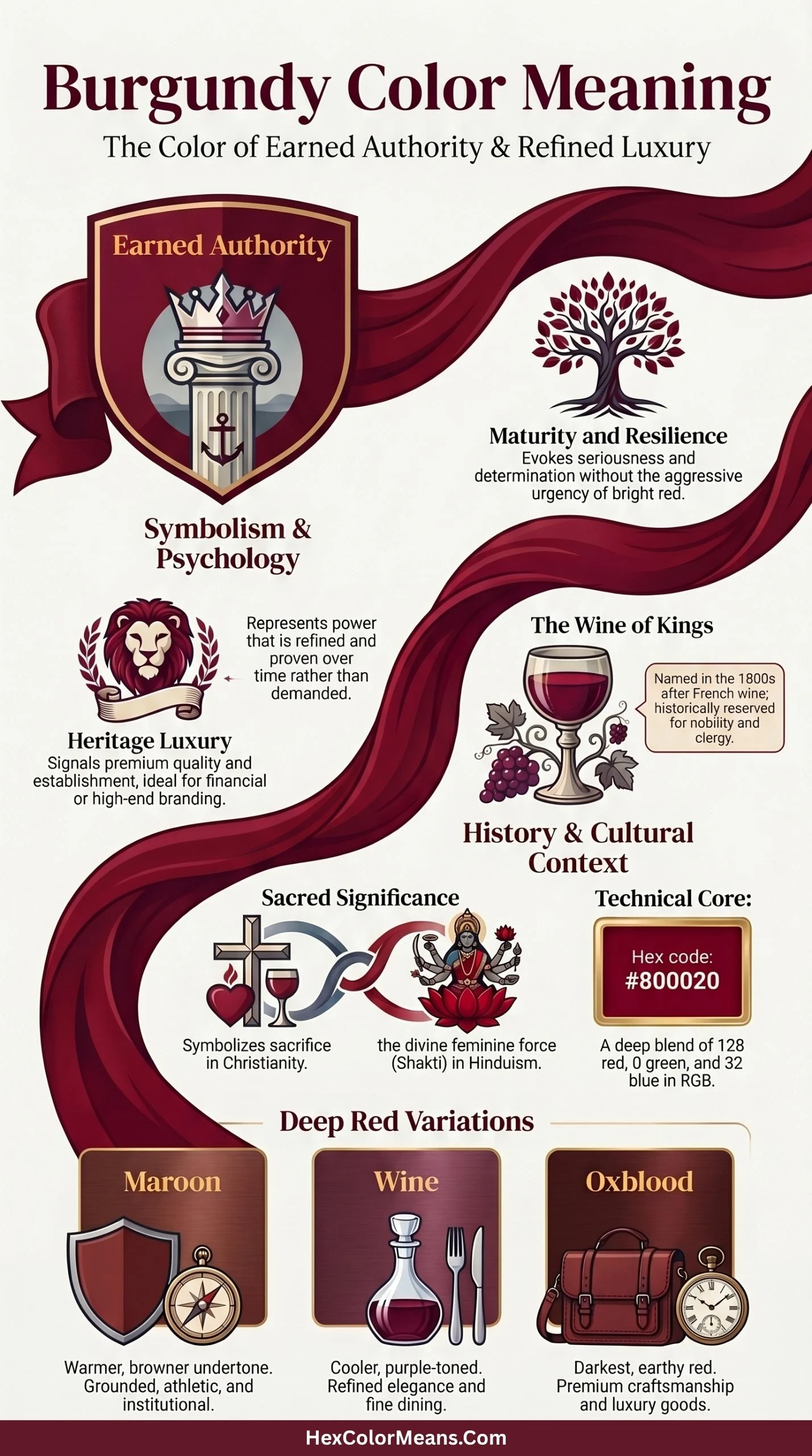
Burgundy is a dark, muted shade of red with noticeable purple and brown undertones. It takes its name from the Burgundy wine region in France, where the deep red wines produced there became iconic across the world. The color is essentially what happens when red grows up: it loses its rawness and gains depth, complexity, and weight.
Common digital codes for true burgundy are listed here.
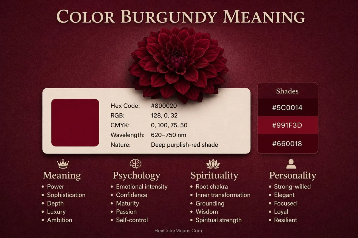
- HEX: #800020
- RGB: 128, 0, 32
- CMYK: 0, 100, 75, 50
- HSL: Hue: 345°, Saturation: 100%, Lightness: 25%
- Pantone: PMS 209 C
Visually, burgundy sits in a rare tonal space. Unlike pure red, which reads as urgent and reactive, burgundy reads as controlled and considered. Its darkness absorbs light rather than reflecting it aggressively, which gives it a sense of solemnity and weight.
The color burgundy is not a single personality. It spans a range of emotional registers depending on the shade. Its most recognized variations include:
- Wine: A cooler, slightly more purple-toned burgundy associated with elegance and refinement.
- Maroon: A warmer, browner variation that feels grounded, athletic, and institutional.
- Crimson: A brighter relative that sits closer to red, radiating passion and urgency.
- Oxblood: An extremely dark, almost earthy shade that signals premium craftsmanship and luxury goods.
- Claret: A lighter, more translucent burgundy tied to fine dining, culture, and old-world prestige.
What Colors Go With Burgundy
Pairing burgundy with the right colors creates compositions that feel rich and deeply layered. Because burgundy carries such intensity and warmth, the colors around it gain a sense of luxury and emotional weight.
Blush and champagne: Creates a soft, romantic pairing that balances burgundy’s depth with airy lightness. The delicacy of blush prevents burgundy from feeling heavy or somber.
Navy blue: A classic, authoritative combination that feels preppy and sophisticated. The coolness of navy grounds burgundy’s heat, creating tension that works beautifully in traditional and corporate settings.
Olive green and sage: Connects burgundy to its earthy, autumnal roots. The pairing feels organic, understated, and deeply harmonious—reminiscent of vineyards and forests.
Gold and brass: Adds instant opulence and celebratory energy. This combination dominates in luxury hotels, formal dining rooms, and evening wear, where burgundy acts as a rich backdrop for metallic shine.
Cream and ivory: Offers a clean, high-contrast pairing that brightens burgundy without competing. The warmth of cream keeps the look inviting rather than stark.
Charcoal gray: A tonal, modern pairing that lets burgundy take center stage. Charcoal provides a smooth, neutral anchor while respecting burgundy’s dramatic character.
Similar Colors to Burgundy
If you are looking for colors similar to burgundy, consider these alternatives.
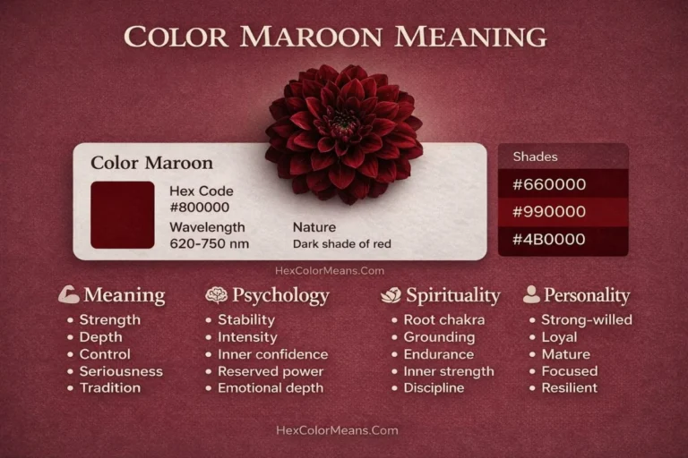
Maroon (Hex: #800000): A slightly browner, less purple version of burgundy. Maroon feels more academic and earthy, lacking burgundy’s wine-like vibrancy.
Oxblood (Hex: #4A0404): A darker, more concentrated red-black with less brightness. Oxblood shares burgundy’s moodiness but reads as more aggressive and gothic.
Merlot (Hex: #7B2D3A): A truer wine-inspired shade with more red and purple balance. Merlot feels closer to burgundy than maroon, with slightly more pink undertone warmth.
Cordovan (Hex: #893F45): A lighter, more brown-red leather tone named after shell cordovan. It shares burgundy’s richness but feels more rustic and broken-in.
Plum (Hex: #5A2A4C): A purple-dominant alternative that leans cooler and more floral. Plum lacks burgundy’s red heat but offers similar dramatic depth.
History and Interesting Facts About Burgundy
History of the Color Burgundy
The story of burgundy begins in the vineyards of eastern France. The Burgundy region produced wines so distinctive and so celebrated that their color became a reference point for everything deeply red and richly refined. As trade routes spread French culture across Europe, that deep red became shorthand for quality and heritage.
Before the name “burgundy” attached itself to the color, similar hues were created through natural dyes extracted from plants and insects. Madder root was one of the most common sources of deep red pigment throughout medieval Europe. Kermes, a dye derived from scale insects, produced rich crimson and near-burgundy tones that were reserved for nobility and church officials. Both materials were labor-intensive to produce and process, reinforcing the association between this color range and power.
During the Renaissance, dark reds gained strong prominence in portraiture. Painters used deep red robes and garments to mark their subjects as figures of authority. The pigment itself, often lead-based or mineral-derived, was costly and technically demanding to apply. Using it communicated both the painter’s skill and the subject’s status.
By the 18th and 19th centuries, burgundy became a staple of military uniforms, academic regalia, and legal dress. It communicated institutional seriousness and rank. When synthetic dyes became available in the late 1800s, burgundy became accessible to a wider market, but its associations with premium quality never faded. If anything, the democratization of the color made its deeper, truer shades more desirable as signals of genuine sophistication.
Interesting Facts About the Color Burgundy
- The name comes directly from wine. The Pinot Noir grapes of the Burgundy region produce a wine so consistently deep red that the color inherited the region’s name globally.
- Burgundy has been a color of academic distinction for centuries. Harvard University uses a shade of crimson-burgundy as its official institutional color, and many older universities around the world follow similar conventions.
- In the fashion industry, burgundy consistently ranks as one of the most commercially successful autumn and winter colors. Pantone has featured it in numerous seasonal palettes across multiple decades.
- Research in color psychology suggests that dark reds like burgundy increase perceptions of competence and authority in professional settings more effectively than bright reds.
- The wine industry’s global influence on the name means “burgundy” is recognized across languages where the French region itself might not be commonly known.
- Burgundy absorbs significantly more light than true red due to its darker value. This physical property makes it feel heavier and more substantial to the human visual system.
- Studies on color and consumer behavior show that burgundy on product packaging correlates with higher perceived price point and quality compared to brighter red alternatives.
Symbolism and Representation of Burgundy
Burgundy is a color of earned authority. Unlike red, which claims power immediately and loudly, burgundy suggests power that has been tested, refined, and proven over time. It is the difference between a newcomer demanding respect and a veteran whose presence alone commands it.
It represents several interconnected ideas. First, it signals depth of experience: this is a color for people and institutions that have weathered time and emerged with integrity. Second, it embodies controlled passion: the fire of red, brought under the discipline of wisdom. Third, it speaks to serious ambition: goals pursued not for show but for genuine achievement.
Burgundy also carries a strong association with sensory pleasure. Its origins in wine culture tie it to taste, aroma, and the rituals of refined enjoyment. A burgundy dining room, a burgundy label on a wine bottle, a burgundy suit at a formal dinner: each of these signals that the person or place takes pleasure seriously and knows how to provide it.
Unlike black, which signals authority through absence and minimalism, burgundy signals it through richness and depth. It is full of something. It holds warmth even in its darkness. That combination of seriousness and warmth is uniquely burgundy’s signature.
Meaning of the Burgundy Color in Spirituality
In spiritual frameworks, burgundy occupies a grounded and powerful space. It is closely connected to the root chakra, Muladhara, which governs survival, security, and physical presence. While pure red is the primary color of this chakra, burgundy’s deeper tone adds a layer of ancestral connection and earned wisdom to those same energies.
A person working with burgundy in a spiritual context is often dealing with themes of personal power, not the kind that dominates others, but the kind that comes from being deeply rooted in one’s own identity and history. It is a color that asks you to stand firm, to know where you come from, and to draw strength from that knowledge.
In various indigenous and traditional spiritual practices, dark red tones are associated with ancestral memory and protection. They appear in ceremonial dress, sacred textiles, and ritual spaces as markers of lineage and inherited strength. Burgundy fits naturally within that tradition.
Many contemporary spiritual practitioners use burgundy candles in rituals focused on courage, self-respect, and breaking negative patterns. Crystals that occupy the burgundy range, such as garnet and red jasper, are used for grounding work, for rebuilding a sense of self after loss, and for calling in sustained energy during long-term endeavors.
Burgundy in spiritual practice does not promise quick illumination. It promises the slower, harder, more lasting work of becoming genuinely strong from the inside out.
Psychological Meaning of the Color Burgundy
Psychologically, burgundy operates in a very specific register. It activates feelings of seriousness, determination, and self-possession. Unlike bright red, which can trigger anxiety or urgency, burgundy’s darker value moderates those impulses. It channels the drive of red into something more sustained and purposeful.
Research in environmental psychology shows that dark, warm tones like burgundy in a space tend to reduce impulsive behavior and encourage more deliberate, considered decision-making. A room with burgundy accents feels different from a red room: more like a study or a library than an arena. That tonal shift changes how the mind operates within the space.
Burgundy also promotes a sense of emotional containment. It holds feelings rather than broadcasting them. People drawn to burgundy often have rich inner emotional lives that they do not easily or casually share. The color reflects their preference for depth over display, for meaning over performance.
On the more challenging side, excessive exposure to burgundy or heavy reliance on it in one’s personal aesthetic can reinforce tendencies toward rigidity, guardedness, or emotional withdrawal. Its heaviness can tip into heaviness of mood if not balanced with lighter, more airy tones. Burgundy works best when used with intention rather than as a default retreat.
For those going through periods of rebuilding, transition, or the need to reclaim authority in their own lives, burgundy functions as a psychologically supportive color. It reinforces the internal narrative that seriousness, effort, and depth of commitment are valuable and worth maintaining.
Burgundy Color Personality Traits
Positive Traits
People who are consistently drawn to burgundy tend to exhibit a distinct set of qualities. They carry a natural gravitas that others notice without fully being able to explain. They do not need external validation to feel secure in their choices. Their confidence is quiet and earned rather than performed and borrowed.
These individuals often possess strong emotional intelligence. They read situations accurately and respond with measured wisdom rather than reactive impulse. They tend to be loyal friends, reliable colleagues, and serious partners. Their word means something because they do not give it lightly.
A love for quality over quantity defines the burgundy personality. They prefer one exceptional thing to several mediocre ones. This extends to relationships, work, possessions, and experiences. They have discerning taste and the patience to wait for what meets their standard.
Negative Traits
The same depth that makes the burgundy personality compelling can become a liability. They can struggle with stubbornness, especially when their sense of authority or expertise is challenged. Letting go of control does not come naturally to them.
They may also tend toward emotional inaccessibility. Their preference for depth over display can read as coldness to people who prefer more open emotional expression. Building trust with a burgundy personality takes time, and not everyone has the patience for it.
A tendency toward perfectionism is also common. The same high standards that produce exceptional work can make starting or finishing difficult when the result seems unlikely to meet their internal benchmark. This can lead to paralysis or procrastination dressed up as discernment.
What Does the Bible Say About the Color Burgundy?
The Bible does not use the word “burgundy” directly, as the term is modern and specific to the French wine region. However, the deep crimson and dark red tones that fall within the burgundy family carry enormous biblical significance. The Scriptures treat this color range as one of the most meaningful in all of sacred experience.
In the Old Testament, scarlet and deep red appear repeatedly in the construction and ornamentation of sacred spaces. Exodus 25:4 lists blue, purple, and scarlet yarn among the materials used in the tabernacle, the portable sanctuary the Israelites carried through the wilderness. These colors were not decorative choices. They were theological statements about the nature of God and the weight of approaching the divine.
The book of Proverbs 31:21 describes the virtuous woman clothing her household in scarlet. This was a sign of her preparedness, her care, and her practical wisdom. The color connoted warmth, protection, and provision.
In the New Testament, the Whore of Babylon in Revelation 17:4 is described as clothed in purple and scarlet, adorned with gold and precious stones. Here, the dark red functions differently: it marks excess, corruption, and the seductive power of worldly wealth unchecked by moral restraint. The same tonal family that signals sacred authority in one context becomes a warning in another.
Most powerfully, Isaiah 1:18 uses the scarlet-to-burgundy range as a metaphor for sin and redemption: “Though your sins are like scarlet, they shall be as white as snow.” The depth and staining permanence of dark red made it the natural metaphor for sin that cannot be easily undone, only transformed by divine grace.
Cultural and Religious Significance of the Burgundy Color
1. Christianity
Within Christianity, deep red tones including burgundy carry powerful liturgical meaning. Pentecost Sunday, which celebrates the descent of the Holy Spirit, is marked by red vestments in many denominations. The color represents the fire and blood of the Spirit’s arrival. Cardinals in the Roman Catholic Church wear deep red robes as a symbol of their willingness to defend the faith, even to the point of death. That shade of ecclesiastical red sits squarely in the burgundy family.
2. Hinduism
In Hindu tradition, deep reds are associated with Shakti, the divine feminine force of creation and power. Goddesses like Durga and Kali are frequently depicted with deep red elements in their imagery. Kumkum, the red powder used in religious rituals and applied to the forehead as a blessing, often takes on a deep burgundy hue when mixed with other pigments. This connects the color to protection, vitality, and sacred feminine authority.
3. Buddhism
The deep maroon and burgundy robes worn by Tibetan Buddhist monks are among the most globally recognized uses of this color in religious practice. The color was chosen historically due to the availability of certain natural dyes, but it has taken on deep symbolic meaning over centuries. It represents the renunciation of worldly color and ornamentation, a stripping back to what is essential and serious in the pursuit of enlightenment.
4. Japanese Culture
In Japan, deep reds including burgundy tones have long been associated with protection and warding off evil. Traditional torii gates at Shinto shrines are often painted a deep vermillion-red that moves into burgundy territory. This color marks the boundary between the sacred and the mundane. Deep red lacquerware, used in formal tea ceremonies and traditional cuisine presentation, also uses this tonal family to signal ritual seriousness and cultural refinement.
5. Ancient Roman and Greek Culture
In Ancient Rome, deep red togas were markers of military achievement and senatorial rank. Generals celebrating triumphs wore deep red, associating the color with victory, sacrifice, and Rome’s imperial ambitions. In Greek mythology, deep red was connected to Ares, the god of war, and to the life force carried in blood. These associations gave the color range a gravitas rooted in the most serious human experiences: conflict, honor, and mortality.
6. African Symbolism
Across many African traditions, deep red including burgundy tones represents ancestral blood, heritage, and spiritual protection. In Kente cloth from Ghana, deep red sections symbolize the blood of the ancestors and the political passion of the people. In various initiation ceremonies across the continent, deep red body markings and garments signal the transition from one life stage to another. The color marks serious thresholds.
7. Western Society
In contemporary Western culture, burgundy retains its associations with premium quality, institutional prestige, and tasteful luxury. It appears consistently in high-end fashion, fine dining interiors, luxury automotive interiors, and professional environments that want to communicate both warmth and authority. It is the color of serious grown-up spaces: the library, the boardroom, the fine restaurant, the respected university.
Dream Interpretations of Color Burgundy
Burgundy in dreams typically connects to themes of personal power, deep emotion, and significant life transitions. When this color appears prominently in a dream, it is rarely incidental. Dream analysts working in both Jungian and traditional frameworks treat dark reds as markers of the dreamer’s relationship with their own authority and emotional depth.
Wearing burgundy clothing in a dream often signals that the dreamer is stepping into or claiming a new level of personal authority. It suggests readiness for a role that carries more weight and responsibility. Burgundy walls or rooms in dreams point to a desire for serious, protected inner space: a place where deep work can happen without distraction or intrusion.
Burgundy liquid, particularly wine, in dreams connects to themes of celebration, heritage, and the passage of time. It may signal that the dreamer is processing legacy, either their own or a family inheritance. Burgundy flowers in dreams suggest a deep emotional connection that carries both beauty and weight: love or devotion that is not light or casual.
Dreams dominated by burgundy often arrive during periods of major personal reckoning: times when the dreamer is confronting questions about who they truly are, what they genuinely value, and what kind of authority they want to claim in their own life.
How to Use the Color Burgundy
Burgundy adds weight and refinement wherever it appears. It functions as an anchor rather than an accent, grounding spaces, brands, and personal aesthetics in something serious and lasting. The sections below detail its most powerful applications.
1. Burgundy Color in Business
In the business world, burgundy communicates a specific set of values immediately and powerfully. It signals that an organization is established, serious, and quality-focused. It does not chase trends because it does not need to. A burgundy business card, letterhead, or office space tells a prospective client that they are dealing with someone who has been here long enough to know exactly what they are doing.
Burgundy works particularly well for law firms, financial advisory companies, heritage hospitality brands, fine dining establishments, and premium educational institutions. It also suits any business where trust and longevity are central to the value proposition. Startups occasionally use it when they want to signal maturity and seriousness beyond their actual age.
2. Burgundy Color in Branding and Marketing
In branding, burgundy occupies a distinct and powerful niche. It communicates heritage luxury rather than flashy new luxury. The difference is significant. Flashy luxury uses gold, white, and bright red. Heritage luxury uses burgundy, navy, and deep forest tones. It says: we have been excellent for a long time, and we do not need to shout about it.
Brands that have successfully used burgundy in their visual identity include Zara, Hershey’s, Marlboro, and numerous premium wine labels. Harvard University’s use of crimson-burgundy has made it one of the most recognizable institutional color identities in the world. In each case, the color does the work of communicating prestige without requiring additional explanation.
Marketers targeting audiences who prioritize quality over novelty, experience over trends, and depth over surface find burgundy consistently effective. It attracts consumers who have moved past the need to be impressed and are now seeking genuine substance.
3. Burgundy Color in Interior Design
In interior design, burgundy functions as a transformative accent or anchor color that immediately elevates the seriousness and warmth of a space. A burgundy sofa in a neutral living room becomes the room’s emotional center. Burgundy wallpaper in a dining room creates an atmosphere of intimate formality that encourages lingering conversation over a long meal.
The most effective pairings for burgundy in interiors include cream and off-white for warmth and contrast, gold and brass metallic for a regal quality, deep navy for a sophisticated dual-anchor palette, and forest green for a richly natural, library-like feel. Burgundy also pairs beautifully with natural wood tones, particularly dark walnut and mahogany, which share its depth and warmth.
Designers frequently use burgundy in bedrooms, home offices, dining rooms, and libraries, rooms where the goal is depth, focus, and a feeling of enclosed, protective comfort. It is not typically the right choice for spaces designed to feel open, airy, or energetically expansive.
4. Burgundy Color in Cinema
Film directors and cinematographers use burgundy to establish specific emotional and narrative registers. In period dramas and historical films, burgundy costumes and set design signal wealth, power, and the moral complexities of privilege. In psychological thrillers, deep red environments including burgundy tones create a sense of contained dread: something serious and perhaps dangerous is present here.
Films like “The Grand Budapest Hotel” by Wes Anderson use the burgundy-and-red palette extensively to create a world of simultaneously comedic and melancholic formality. The color tells you immediately that this world takes its own rituals seriously, even as it gently mocks them. In Stanley Kubrick’s work, deep reds including burgundy tones appear in some of the most psychologically charged scenes, reinforcing the color’s power to signal that something of profound weight is happening.
5. Burgundy Color in Fashion and Personal Style
Burgundy is one of the most consistently versatile and wearable dark colors in fashion. Unlike black, which can read as stark or deliberately minimal, burgundy reads as warm, intentional, and deeply considered. It is a color that signals that the wearer has thought about what they are wearing and why.
In professional settings, a burgundy blazer or structured dress communicates authority with warmth. It avoids the potential coldness of all-black while maintaining its seriousness. In casual contexts, burgundy knitwear, boots, or accessories add depth and sophistication to otherwise simple outfits without making them feel overdressed.
Burgundy works across a wide range of skin tones, though it is particularly striking against deeper skin tones where its warmth resonates and against very fair skin tones where its depth creates dramatic contrast. Fashion houses return to it season after season because it sells reliably. It is the rare trend that is actually timeless.
6. Burgundy Color in Makeup
Burgundy makeup occupies a powerful position in the beauty world. A burgundy lip is one of the most studied and replicated looks in contemporary beauty for a reason: it hits the sweet spot between high drama and wearable elegance. It is darker and more complex than a standard red lip but warmer and more approachable than a true plum.
For eyes, burgundy eyeshadow used in the crease creates depth and dimension that enhances almost every eye color. Brown eyes gain warmth and intensity. Blue eyes benefit from the complementary contrast. Green eyes find the adjacent red tones bring out their unique hue more vividly. A burgundy smoky eye reads as more sophisticated and less Halloween-costume than a standard black smoky eye.
Burgundy nail color follows the same principle across seasons. It is the nail color that works for a board meeting, a dinner date, and a winter wedding equally well. For a fully coordinated burgundy beauty look, consider: a deep burgundy lip, a warmed-up burgundy crease, and a sheer berry-toned blush that bridges the two. These elements build a cohesive aesthetic that feels intentional without being costume-like.
7. Burgundy Foods
Foods that fall into the burgundy color family are not just visually striking: they are among the most nutritionally dense foods available. Their dark red pigmentation comes from anthocyanins and betalains, potent plant compounds with well-documented health benefits including reduced inflammation, improved cardiovascular function, and enhanced cognitive performance.
Red wine, the food most directly associated with the color’s name, contains resveratrol, a compound studied extensively for its potential effects on longevity and heart health. In moderation, the cardiovascular associations with moderate red wine consumption remain one of the more studied areas in nutritional epidemiology.
Beets in their deep red-burgundy form are among the richest dietary sources of nitrates, which support healthy blood flow and have been linked to improved athletic endurance. Dark cherries in the burgundy range are loaded with melatonin and anti-inflammatory compounds that support sleep quality and muscle recovery. Kidney beans provide exceptional plant protein and iron. Red cabbage offers vitamin C, vitamin K, and a spectrum of anthocyanins that support brain health and immune function.
Including burgundy foods in a regular diet means building a genuinely functional nutritional palette, one where the visual richness of the color corresponds directly to the richness of the nutritional content.
8. Burgundy Color in Quotes and Idioms
The English language does not have as many burgundy-specific idioms as it does for red, but the color appears in literature and speech in ways that reflect its associations. Descriptions of wine often invoke burgundy as shorthand for depth and quality: a “good burgundy” is not just a wine but a reference to a certain kind of pleasurable, serious experience.
In literary description, “burgundy shadows” suggests a mood of weighted, autumnal melancholy: not the sharp grief of black but the rich sadness of something beautiful in its decline. “Burgundy skies” at dusk signal the transition from day to night with a gravity that orange and pink sunsets do not carry. These uses reinforce the color’s association with transitional moments of significance: endings that carry beauty because of what they contained.
In fashion journalism and lifestyle writing, “burgundy” functions as a quality signal within descriptions. A “burgundy leather briefcase” or “burgundy velvet armchair” communicates a specific aesthetic level without requiring additional adjectives. The color does the work of “premium” and “considered” by itself.
9. Burgundy Color in Art and Architecture
Artists have long used deep red tones including burgundy to signal the weight of what they are depicting. In Renaissance portraiture, dark red robes on a subject communicated immediately that this was a person of consequence. The cost of producing dark red pigments, including vermillion and genuine red lake, meant that artists used them deliberately and their presence in a composition was never casual.
In Mark Rothko’s large-scale color field paintings, deep red and burgundy tones dominate some of his most emotionally charged works. Rothko believed color could induce profound emotional and even spiritual states in viewers. His burgundy compositions feel simultaneously like rooms and like presences: you do not just look at them, you experience them. The Rothko Chapel in Houston, with its dark, maroon-edged canvases, remains one of the most powerful examples of color used architecturally for spiritual effect.
In architecture, burgundy appears most powerfully in institutional and heritage buildings: the deep red brick of old universities, the burgundy awnings of established restaurants and hotels, the deep red leather of traditional club chairs and parliamentary benches. Each application communicates the same message: we have been here long enough to know what we are doing, and we are serious about it.
10. Songs With Burgundy in the Title or Theme
Music uses burgundy as a metaphor for experiences that carry depth, complexity, and emotional weight. “Burgundy” by Wale uses the color to frame a meditation on desire and emotional complexity in relationships: burgundy as a middle space between the heat of red and the coolness of distance.
“Maroon” by Taylor Swift, from the Midnights album, uses this closely related shade to explore the same emotional territory: a color that holds the memory of intense experience, the stain of something that mattered enormously and left a mark. The imagery in the song ties the color directly to the permanence of significant emotional events.
Across these examples, burgundy in music does not describe something light or passing. It marks experiences that have weight, duration, and consequence. The color’s musical appearances consistently position it as a shade for grown, complex, emotionally serious experience.
11. Cities and Places Associated With Burgundy
The most direct geographic association with burgundy is the Burgundy region of France itself, officially called Bourgogne. This area in east-central France is responsible for the color’s name through its world-renowned wine production. The Côte d’Or, the golden hillside at the heart of the region, produces Pinot Noir wines whose deep garnet-burgundy color set the global standard for what this shade means aesthetically and culturally.
Beyond France, Dijon, the capital of the Bourgogne-Franche-Comté region, has an entire cultural identity built around the sophistication and heritage that burgundy represents. The city’s mustard, its architecture, and its culinary culture all carry the color’s associations of refined, serious pleasure.
In the United States, Cambridge, Massachusetts, home to Harvard University, has built an institutional identity around its crimson-burgundy color that makes the shade synonymous with academic prestige and intellectual seriousness in the American cultural imagination. Visiting the campus in autumn, when the brick buildings align with the fall foliage, is one of the most vivid real-world experiences of burgundy as an environmental color.
12. The Color Burgundy in the Garden
Incorporating burgundy into garden design creates a dramatically different atmosphere from gardens built around bright, saturated colors. Burgundy plants recede slightly in the landscape, creating depth and shadow even in full sun. They make surrounding greens appear more vivid by contrast. A garden with burgundy elements feels more serious and intentional, more like a designed space than a casual collection of plants.
Burgundy Iceberg roses bring a formal, classical beauty that bridges the gap between traditional cottage gardens and more structured contemporary designs. Heuchera varieties in burgundy and near-black tones are among the most popular perennial choices for shade gardens because they provide sustained color through the entire growing season. Dahlias in deep burgundy tones are among the most photographed flowers at autumn garden shows, their density and complexity of form perfectly matched by the color’s emotional weight.
For foliage, burgundy Japanese maples (Acer palmatum varieties) are among the most prized specimen plants in temperate garden design. Their delicate, deeply colored leaves create a year-round focal point that no other plant in the burgundy family quite matches. Pairing these with silver or gray-toned plants and cream-colored flowers creates a garden palette that feels sophisticated without being stark.
A Final Note
Burgundy operates on a level that most colors cannot reach. It carries history in its pigment, sophistication in its depth, and emotional intelligence in its restraint. It is a color that asks something of the spaces and people it touches: seriousness, intention, and a willingness to engage with what is genuinely meaningful rather than merely attractive.
Its associations with wine, academic prestige, spiritual practice, and institutional authority are not accidental. They all point to the same underlying quality: burgundy belongs to experiences and entities that have been tested and refined over time. It is not a color for the impatient or the superficial.
If you want to bring burgundy into your life more intentionally, consider starting with one anchor piece rather than an entire environment. A single burgundy accent in a room, a burgundy garment in a wardrobe, a burgundy notebook on a desk: these small commitments to the color begin building its associations in your daily experience. Over time, you may find that the color’s qualities, its depth, its seriousness, its warmth, begin to feel like a natural extension of how you want to move through the world.
Applied with awareness, burgundy is not just a color. It is a commitment to substance over surface, and to the kind of long-term quality that only time can produce.